
目次
1. mlxtendの可視化
1.1 主成分分析(PCA Correlation)
1.2 主成分分析の可視化モジュール
2. 実験
2.1 環境構築
2.2 データセット
2.3 主成分分析(PCA Correlation)
2.4 学習曲線(Learning Curve)
2.5 混同行列(Confusion Matrix)
2.6 決定境界(Decision Regions)
2.7 線形回帰(Linear Regression)
関連記事:
1. mlxtendの可視化
Mlxtendは machine learning extensionsの英語略称で、データ分析で発生する作業のライブラリです。サンプルデータ、前処理、モデル作成、モデル評価、可視化などのモジュールを提供しています。今回は可視化のモジュールを解説したいと思います。
Mlxtendの可視化モジュール:http://rasbt.github.io/mlxtend/user_guide/plotting/plot_linear_regression/
Mlxtendのgithub:https://github.com/rasbt/mlxtend
1.2 主成分分析の可視化モジュール
– 主成分分析(PCA Correlation)
主成分分析は多数変数の相関係数を計算します。
Mlxtendではplot_pca_correlation_graphの関数を利用します。
– 学習曲線(Learning Curve)
学習曲線は横軸に試行回数や時間経過を元にした累積経験数、学習と訓練の結果を表示します。
Mlxtendではplot_learning_curvesの関数を利用します。
– 混同行列(Confusion Matrix)
混同行列は2 値分類問題で正解・不正解の結果をまとめたマトリックスで表します。Mlxtendではplot_confusion_matrixの関数を利用します。
– 決定境界(Decision Regions)
決定境界はデータの分類予測を行う際に予測の基準となる境界線のことです。
Mlxtendではplot_decision_regionsの関数を利用します。
– 回帰直線(Linear Regression Line)
回帰直線は散布図で直線的な傾向が見て取れる2つの変数の直相関係数を表します。
Mlxtendではplot_linear_regressionの関数を利用します。
2. 実験
2.1 環境構築(Google colab)
Mlxtendをアップグレードします。
| !pip install mlxtend –upgrade |
Mlxtendのバージョンを確認します。
| import mlxtend print(mlxtend.__version__) |
0.19.0
2.2 データセット
Irisのデータセットを読み込みます。学習と訓練のデータセットを分けます。
| from mlxtend.plotting import plot_learning_curves import matplotlib.pyplot as plt from sklearn import datasets
from mlxtend.preprocessing import shuffle_arrays_unison from sklearn.neighbors import KNeighborsClassifier import numpy as np
iris = datasets.load_iris() X = iris.data y = iris.target
feature_names = iris.feature_names class_names = iris.target_names
X, y = shuffle_arrays_unison(arrays=[X, y], random_seed=123) X_train, X_test = X[:120], X[120:] y_train, y_test = y[:120], y[120:] |
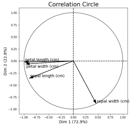
2.3 主成分分析(PCA Correlation)
主成分分析のチャットを作成します。Sapal widthの特徴量は別の特徴量を外れています。
| from mlxtend.plotting import plot_pca_correlation_graph
X_norm = X / X.std(axis=0) # Normalizing the feature columns
figure, correlation_matrix = plot_pca_correlation_graph(X_norm, feature_names, dimensions=(1, 2), figure_axis_size=7) |
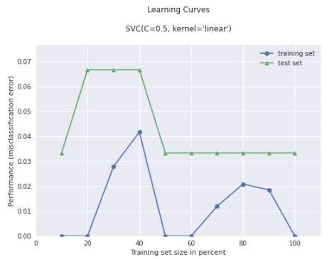
2.4 学習曲線(Learning Curve)
SVCの分類分析を学習して、学習曲線を作成します。
| # Plot plot_learning_curves
from sklearn.svm import SVC
# Training a classifier svm = SVC(C=0.5, kernel=’linear’) svm.fit(X, y)
# Plot plot_learning_curves(X_train, y_train, X_test, y_test, svm, train_marker = ‘o’, test_marker = ‘^’, style = ‘seaborn’, # https://matplotlib.org/stable/gallery/style_sheets/style_sheets_reference.html scoring = ‘misclassification error’ ) plt.show() |
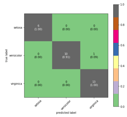
2.5 混同行列(Confusion Matrix)
サイズ、色テーマ、クラス名などを設定して、混同行列を作成します。
| from sklearn.metrics import confusion_matrix from mlxtend.plotting import plot_confusion_matrix import matplotlib.pyplot as plt import numpy as np
y_true = y_test y_pred = svm.predict(X_test)
confusion_matrix_array = confusion_matrix(y_true, y_pred)
fig, ax = plot_confusion_matrix(conf_mat=confusion_matrix_array, figsize=(7, 7), show_absolute=True, show_normed=True, colorbar=True, cmap=’Accent’, # https://matplotlib.org/stable/tutorials/colors/colormaps.html class_names = class_names, )
plt.show() |
2.6 決定境界(Decision Regions)
SVCの分類分析を作成して、sepal lengthとpetal length の決定境界を作成します。
| from mlxtend.plotting import plot_decision_regions from sklearn.svm import SVC
X = iris.data[:, [0, 2]]
# Training a classifier svm = SVC(C=0.5, kernel=’linear’) svm.fit(X, y)
# Plotting decision regions plot_decision_regions(X, y, clf=svm, legend=2)
# Adding axes annotations plt.xlabel(‘sepal length [cm]’) plt.ylabel(‘petal length [cm]’) plt.title(‘SVM on Iris’) plt.show() |

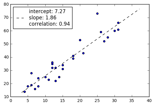
2.7 線形回帰(Linear Regression)
X,yのデータセットを作成します。作成したデータで線形回帰の図を作成します。
| import matplotlib.pyplot as plt from mlxtend.plotting import plot_linear_regression import numpy as np
X = np.array([4, 8, 13, 26, 31, 10, 8, 30, 18, 12, 20, 5, 28, 18, 6, 31, 12, 12, 27, 11, 6, 14, 25, 7, 13,4, 15, 21, 15])
y = np.array([14, 24, 22, 59, 66, 25, 18, 60, 39, 32, 53, 18, 55, 41, 28, 61, 35, 36, 52, 23, 19, 25, 73, 16, 32, 14, 31, 43, 34])
intercept, slope, corr_coeff = plot_linear_regression(X, y) plt.show() |

担当者:HM
香川県高松市出身 データ分析にて、博士(理学)を取得後、自動車メーカー会社にてデータ分析に関わる。その後コンサルティングファームでデータ分析プロジェクトを歴任後独立 気が付けばデータ分析プロジェクトだけで50以上担当
理化学研究所にて研究員を拝命中 応用数理学会所属