
前回はkaggleコンペでメルカリについて解説しました。今回の記事はAutoEncoderを使ってKaggle のクレジットカードの詐欺検知を解説します。
目次
1. Keras Encoder
2. Kaggleクレジットカード不正利用データ(Credit Card Fraud Detection)
3. 実験・コード
__3.1 データ読み込み
__3.2 データ可視化
__3.3 データ加工
__3.4 Encoderモデル
__3.5 モデル評価
1. Keras Autoencoder
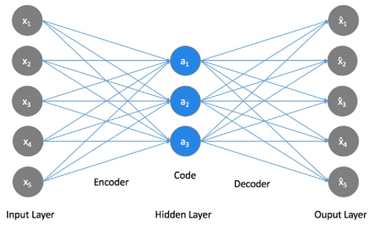
自己符号化器 (autoencoder; AE) は入力を出力にコピーするように学習させたNNです。データが低次元多様体や多様体の小さい集合の周りに集中しているという考えに基づいている。AutoEncoder は特徴量の次元圧縮や異常検知など、幅広い用途に用いられています。
基本的には下図のように、入力と出力が同じになるようにニューラルネットワークを学習させるものです。入力をラベルとして扱っていて、教師あり学習と教師なし学習の中間に位置するような存在です。普通のニューラルネットワークと同様に勾配降下法(gradient descent)などを使って学習させることができます。
2. Kaggleクレジットカード不正利用データ

https://www.kaggle.com/mlg-ulb/creditcardfraud#creditcard.csv
2013年9月の2日間の欧州の人が持つカードで、取引を記録したデータセットです。
284,807件の取引があり、その中に492件詐欺行為が含まれて、極めて不均衡なデータセットとなっています。各レコードには不正利用か否かを表す値(1ならば不正利用)を持っていますが、当然ながらほとんどが0となっています。また、個人情報に関わるため、タイムスタンプと金額以外の項目が主成分分析(および標準化)済みとなっていることも特徴です。
3. 実験・コード
3.1 データ読み込み
環境:Google Colab GPU
ライブラリのインポート
import pandas as pd
import seaborn as sns
from pylab import rcParams

%matplotlib inline

sns.set(style='whitegrid', palette='muted', font_scale=1.5)
rcParams['figure.figsize'] = 10, 6
LABELS = ["Normal", "Fraud"]
RANDOM_SEED = 33
Googleドライブからデータ読み込み
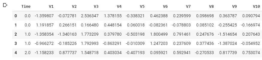
input_data = '/content/drive/My Drive/dataset/creditcardfraud/creditcard.csv'

df = pd.read_csv(input_data)
df.head()
5 rows × 31 columns
PCAによって特徴量V1~V27に変換された形式で提供されている。 Classは0なら正常決済、1なら不正決済を表す。
データの確認
df.shape
(284807, 31)
284,807件 31列のデータです。
欠損値の確認
df.isnull().values.any()
False
欠損値がないと確認しました。
3.2 データ可視化
import matplotlib.pyplot as plt

count_classes = pd.value_counts(df['Class'], sort = True)
count_classes.plot(kind = 'bar', rot=0)
plt.title("Transaction class distribution")
plt.xticks(range(2), LABELS)
plt.xlabel("Class")
plt.ylabel("Frequency");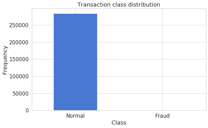
不正利用かどうかは’Class’列に入っており、1ならば不正利用です。 Classが0のサンプル数が284,315に対して、1のサンプル数は492と、不均衡な分布です。
frauds = df[df.Class == 1]
normal = df[df.Class == 0]
print(frauds['Class'].value_counts())
print(normal['Class'].value_counts())
1 492
Name: Class, dtype: int64
0 284315
Name: Class, dtype: int64
不正利用は492件 普通利用は284315件と確認しました。
frauds.Amount.describe()
count 492.000000
mean 122.211321
std 256.683288
min 0.000000
25% 1.000000
50% 9.250000
75% 105.890000
max 2125.870000
Name: Amount, dtype: float64
normal.Amount.describe()
count 284315.000000
mean 88.291022
std 250.105092
min 0.000000
25% 5.650000
50% 22.000000
75% 77.050000
max 25691.160000
Name: Amount, dtype: float64
記述統計学データにより、不正利用の平均値の方が高いが、普通利用の最大値のほうが高いと確認しました。
Amountの特徴量の確認
f, (ax1, ax2) = plt.subplots(2, 1, sharex=True)
f.suptitle('Amount per transaction by class')

bins = 50

ax1.hist(frauds.Amount, bins = bins)
ax1.set_title('Fraud')

ax2.hist(normal.Amount, bins = bins)
ax2.set_title('Normal')

plt.xlabel('Amount ($)')
plt.ylabel('Number of Transactions')
plt.xlim((0, 20000))
plt.yscale('log')
plt.show();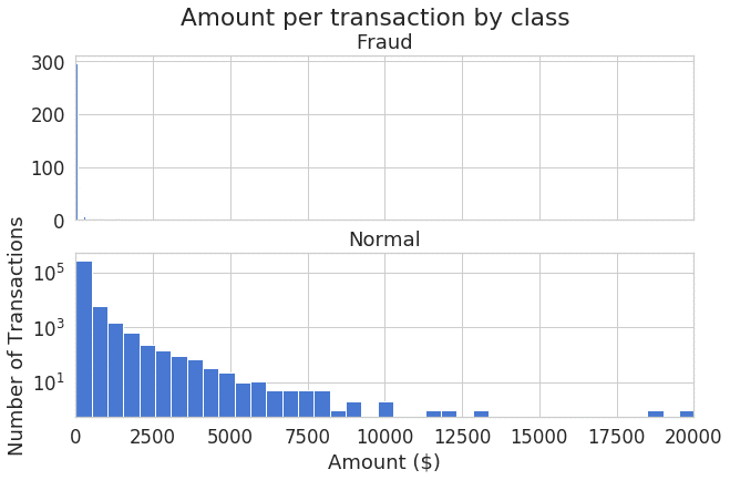
金額のヒストグラムによって、左歪曲分布を確認しました。
時間の特徴量の確認
f, (ax1, ax2) = plt.subplots(2, 1, sharex=True)
f.suptitle('Time of transaction vs Amount by class')

ax1.scatter(frauds.Time, frauds.Amount)
ax1.set_title('Fraud')

ax2.scatter(normal.Time, normal.Amount)
ax2.set_title('Normal')

plt.xlabel('Time (in Seconds)')
plt.ylabel('Amount')
plt.show()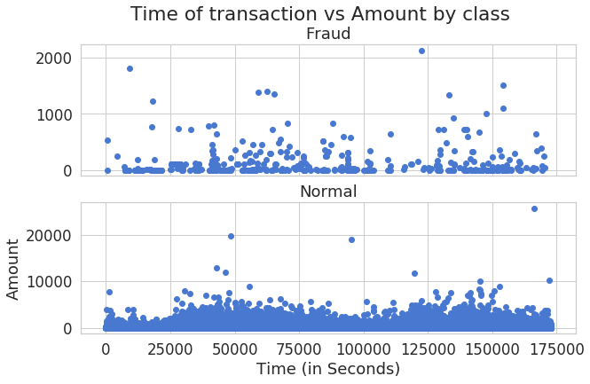
時間の分布図により、不正利用と普通利用のパターンは違うと見えます。
3.3 データ加工
StandardScalerの処理
from sklearn.preprocessing import StandardScaler

data = df.drop(['Time'], axis=1)
data['Amount'] = StandardScaler().fit_transform(data['Amount'].values.reshape(-1, 1))
学習とテストデータを分ける
from sklearn.model_selection import train_test_split

X_train, X_test = train_test_split(data, test_size=0.2, random_state=RANDOM_SEED)
X_train = X_train[X_train.Class == 0]
X_train = X_train.drop(['Class'], axis=1)
y_test = X_test['Class']
X_test = X_test.drop(['Class'], axis=1)
X_train = X_train.values
X_test = X_test.values
X_train.shape
(227456, 29)
80%学習と20%テストを分けました。
3.4 Encoderモデル
from keras import regularizers
from keras.models import Model, load_model
from keras.layers import Input, Dense
from keras.callbacks import ModelCheckpoint, TensorBoard

input_dim = X_train.shape[1]
encoding_dim = 14
input_layer = Input(shape=(input_dim, ))
encoder = Dense(encoding_dim, activation="tanh",
   activity_regularizer=regularizers.l1(10e-5))(input_layer)
encoder = Dense(int(encoding_dim / 2), activation="relu")(encoder)
decoder = Dense(int(encoding_dim / 2), activation='tanh')(encoder)
decoder = Dense(input_dim, activation='relu')(decoder)
autoencoder = Model(inputs=input_layer, outputs=decoder)
print(autoencoder.summary())
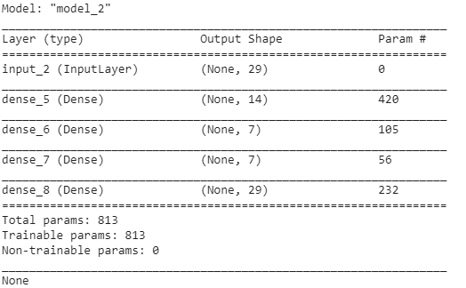
Sequentialモデルを利用し、レイヤは29→14→7→7→14→29と設定しました。
活性化関数は、relu/tanhを利用しています。
活性化関数(Activation Function)の説明はこちらです。
nb_epoch = 100
batch_size = 32
autoencoder.compile(optimizer='adam',
   loss='mean_squared_error',
   metrics=['accuracy'])
checkpointer = ModelCheckpoint(filepath="model.h5",
   verbose=0,
   save_best_only=True)
tensorboard = TensorBoard(log_dir='./logs',
   histogram_freq=0,
   write_graph=True,
   write_images=True)
history = autoencoder.fit(X_train, X_train,
   epochs=nb_epoch,
   batch_size=batch_size,
   shuffle=True,
   validation_data=(X_test, X_test),
   verbose=1,
   callbacks=[checkpointer, tensorboard]).history
Train on 227456 samples, validate on 56962 samples
Epoch 1/100
227456/227456 [==============================] – 25s 108us/step – loss: 0.8146 – acc: 0.5884 – val_loss: 0.8007 – val_acc: 0.6297
…
Epoch 100/100
227456/227456 [==============================] – 24s 104us/step – loss: 0.7070 – acc: 0.7034 – val_loss: 0.7436 – val_acc: 0.7014
100エポックを行いました。70%accuraryになりました。
3.5 モデル評価
plt.plot(history['loss'])
plt.plot(history['val_loss'])
plt.title('model loss')
plt.ylabel('loss')
plt.xlabel('epoch')
plt.legend(['train', 'test'], loc='upper right');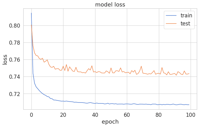
エポックとエラーの線グラフを見ると、ちょっと過剰適合になりました。
過学習と未学習の説明はこちらです。
import numpy as np

predictions = autoencoder.predict(X_test)
mse = np.mean(np.power(X_test - predictions, 2), axis=1)
error_df = pd.DataFrame({'reconstruction_error': mse,
'true_class': y_test})
error_df.describe()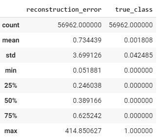
from sklearn.metrics import (confusion_matrix, precision_recall_curve, auc,
   roc_curve, recall_score, classification_report, f1_score,
   precision_recall_fscore_support)

fpr, tpr, thresholds = roc_curve(error_df.true_class, error_df.reconstruction_error)
roc_auc = auc(fpr, tpr)

plt.title('Receiver Operating Characteristic')
plt.plot(fpr, tpr, label='AUC = %0.4f'% roc_auc)
plt.legend(loc='lower right')
plt.plot([0,1],[0,1],'r--')
plt.xlim([-0.001, 1])
plt.ylim([0, 1.001])
plt.ylabel('True Positive Rate')
plt.xlabel('False Positive Rate')
plt.show();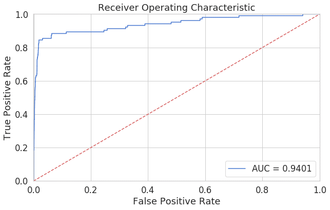
ROC曲線は先程の偽陽性率と真陽性率の表をプロットすると上記のようなグラフが出来上がります。このように、閾値を変化させたときの偽陽性率と真陽性率による各点を結んだものがROC曲線です。ROC曲線下面積(AUC: area under the curve)であり、0.5 – 1.0の値をとります。0.94のAUCは良いモデルと考えられます。
ROCとAUC曲線の詳細はこちらです。
plt.plot(th, precision[1:], 'b', label='Threshold-Precision curve')
plt.title('Precision for different threshold values')
plt.xlabel('Threshold')
plt.ylabel('Precision')
plt.show()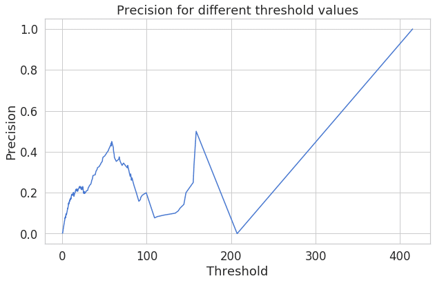
再構成エラーが増加すると、精度も向上することがわかります。
予測
threshold = 2.9
groups = error_df.groupby('true_class')
fig, ax = plt.subplots()

for name, group in groups:
   ax.plot(group.index, group.reconstruction_error, marker='o', ms=3.5, linestyle='',
   label= "Fraud" if name == 1 else "Normal")
ax.hlines(threshold, ax.get_xlim()[0], ax.get_xlim()[1], colors="r", zorder=100, label='Threshold')
ax.legend()
plt.title("Reconstruction error for different classes")
plt.ylabel("Reconstruction error")
plt.xlabel("Data point index")
plt.show();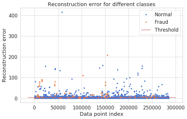
青いの点が正常決済、オレンジの点が不正決済。完全ではないが、やや分離てきています。
y_pred = [1 if e > threshold else 0 for e in error_df.reconstruction_error.values]
conf_matrix = confusion_matrix(error_df.true_class, y_pred)
plt.figure(figsize=(5, 5))
sns.heatmap(conf_matrix, xticklabels=LABELS, yticklabels=LABELS, annot=True, fmt="d");
plt.title("Confusion matrix")
plt.ylabel('True class')
plt.xlabel('Predicted class')
plt.show()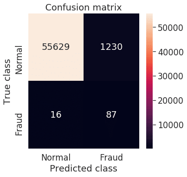
混同行列を確認しました。True Negative (不正が正しく予測できる)が多いと思います。