目次
1. 積み上げ縦棒グラフ
2. 積み上げ縦棒グラフ (割合)
3. 積み上げ横棒グラフ
4. 積み上げ横棒グラフ (割合)
NumpyとPandasのデータフレームのデータソースでmatplotlib での積み上げ棒グラフを作成する方法について解説します。
ライブラリのインポート
| import matplotlib.pyplot as plt import numpy as np import pandas as pd plt.style.use(‘seaborn’) |
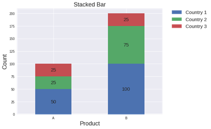
1. 積み上げ縦棒グラフ
積み上げ縦棒グラフを作成します。
| # Data df = pd.DataFrame([[‘A’, 50, 25, 25], [‘B’, 100, 75, 25]], columns=[‘Product’, ‘Country 1’, ‘Country 2’, ‘Country 3′])
# Chart ax = df.plot(x=’Product’, stacked=True, kind=’bar’, figsize=(8, 6), rot=’horizontal’)
# Value for rect in ax.patches: height = rect.get_height() width = rect.get_width() x = rect.get_x() y = rect.get_y()
# Position label_text = f'{height:.0f}’ label_x = x + width / 2 label_y = y + height / 2
# Plot value if height > 0: ax.text(label_x, label_y, label_text, ha=’center’, va=’center’, fontsize=15)
ax.legend(bbox_to_anchor=(1.05, 1), loc=’upper left’, borderaxespad=0., fontsize=15) ax.set_ylabel(“Count”, fontsize=18) ax.set_xlabel(“Product”, fontsize=18) plt.title(‘Stacked Bar’, fontsize=18)
plt.show() |
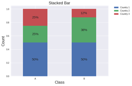
2. 積み上げ縦棒グラフ (割合)
割合のデータを作成して、積み上げ縦棒グラフを作成します。
| # Data df = pd.DataFrame([[‘A’, 50, 25, 25], [‘B’, 100, 75, 25]], columns=[‘Product’, ‘Country 1’, ‘Country 2’, ‘Country 3’]) prodcut_list = df[‘Product’].values int_df = df.select_dtypes(include=[‘int64′]) df = int_df.div(int_df.sum(axis=1), axis=0)
# Chart ax = df.plot(stacked=True, kind=’bar’, figsize=(8, 6), rot=’horizontal’)
# Value for rect in ax.patches: height = rect.get_height() width = rect.get_width() x = rect.get_x() y = rect.get_y()
# Position label_text = f'{height:.0%}’ label_x = x + width / 2 label_y = y + height / 2
# Plot Value if height > 0: ax.text(label_x, label_y, label_text, ha=’center’, va=’center’, fontsize=15)
ax.legend(bbox_to_anchor=(1.05, 1), loc=’upper left’, borderaxespad=0.) ax.set_ylabel(“Count”, fontsize=18) ax.set_xlabel(“Class”, fontsize=18) plt.xticks(list(range(len(prodcut_list))), prodcut_list) plt.title(‘Stacked Bar’, fontsize=18)
plt.show() |
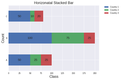
3. 積み上げ横棒グラフ
積み上げ横棒グラフを作成します。
| # Data df = pd.DataFrame([[‘A’, 50, 25, 25], [‘B’, 100, 75, 25], [‘C’, 50, 10, 20]], columns=[‘Product’, ‘Country 1’, ‘Country 2’, ‘Country 3′])
# Chart ax = df.plot(x=’Product’, stacked=True, kind=’barh’, figsize=(8, 6), rot=’horizontal’)
# Value for rect in ax.patches: height = rect.get_height() width = rect.get_width() x = rect.get_x() y = rect.get_y()
# Position label_text = f'{width:.0f}’ label_x = x + width / 2 label_y = y + height / 2
# Plot value if height > 0: ax.text(label_x, label_y, label_text, ha=’center’, va=’center’, fontsize=15)
ax.legend(bbox_to_anchor=(1.05, 1), loc=’upper left’, borderaxespad=0.) ax.set_ylabel(“Count”, fontsize=18) ax.set_xlabel(“Class”, fontsize=18) plt.title(‘Horizonatal Stacked Bar’, fontsize=18)
plt.show() |
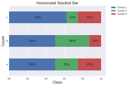
4. 積み上げ横棒グラフ (割合)
割合のデータを作成して、積み上げ横棒グラフを作成します。
| # Data df = pd.DataFrame([[‘A’, 50, 25, 25], [‘B’, 100, 75, 25], [‘C’, 50, 10, 20]], columns=[‘Product’, ‘Country 1’, ‘Country 2’, ‘Country 3’])
prodcut_list = df[‘Product’].values int_df = df.select_dtypes(include=[‘int64′]) df = int_df.div(int_df.sum(axis=1), axis=0)
# Chart ax = df.plot(stacked=True, kind=’barh’, figsize=(8, 6), rot=’horizontal’)
# Value for rect in ax.patches: height = rect.get_height() width = rect.get_width() x = rect.get_x() y = rect.get_y()
# Position label_text = f'{width:.0%}’ label_x = x + width / 2 label_y = y + height / 2
# Plot value if height > 0: ax.text(label_x, label_y, label_text, ha=’center’, va=’center’, fontsize=15)
ax.legend(bbox_to_anchor=(1.05, 1), loc=’upper left’, borderaxespad=0.) ax.set_ylabel(“Count”, fontsize=18) ax.set_xlabel(“Class”, fontsize=18) plt.yticks(list(range(len(prodcut_list))), prodcut_list) plt.title(‘Horizonatal Stacked Bar’, fontsize=18)
plt.show() |

担当者:HM
香川県高松市出身 データ分析にて、博士(理学)を取得後、自動車メーカー会社にてデータ分析に関わる。その後コンサルティングファームでデータ分析プロジェクトを歴任後独立 気が付けばデータ分析プロジェクトだけで50以上担当
理化学研究所にて研究員を拝命中 応用数理学会所属