
目次
1. Isolation Forestとは
2. scikit-learnのIsolationForest
3. 実験
_3.1 データ作成
_3.2 IsolationForestモデル作成
_3.3 モデル評価
1. Isolation Forestとは
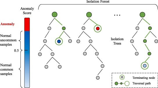
Isolation Forestは、他の一般的な外れ値検出方法とは異なり、通常のデータポイントをプロファイリングする代わりに、異常を明示的に識別(分類)します。 Isolation Forestは、他のランダムフォレストと同様に、決定木に基づいて構築されます。最初に特徴量をランダムに選択し、選択した特徴量の最小値と最大値の間でランダムな分割値を選択することによって、パーティションが作成されます。
異常データは通常の観測よりも頻度が低く、値の通常の点とは異なります。 そのため、このようなランダムパーティションを使用することで、必要な分割を減らして、ツリーのルートに近い場所でそれらを識別する必要があります。
距離が異常スコアを表し、距離が小さい=異常スコアが高いものです。異常な外れ値的データ点は、早い段階で(木の浅い段階で)分割される確率が高くでてきます。
論文:https://ieeexplore.ieee.org/document/4781136
異常スコアの計算式
異常な値をもつデータはたしかに早い段階でisolateされますが、その平均深さをそのままではなく、その木でふつうに二分探索する際の平均深さ c(n)c(n) で正規化しています。そのため異常スコアを(0,1)区間に収めているため扱いやすくなります。確率値s(x, n)が、1に近いと異常値、0.5に近いと正常値と見なせるようになります。
2. scikit-learnのIsolationForest
https://scikit-learn.org/stable/modules/generated/sklearn.ensemble.IsolationForest.html
| sklearn.ensemble.IsolationForest(*, n_estimators=100, max_samples=’auto’, contamination=’auto’, max_features=1.0, bootstrap=False, n_jobs=None, random_state=None, verbose=0, warm_start=False) |
n_estimatorsint, default=100
アンサンブル内の基本推定量の数
max_samples“auto”, int or float, default=”auto”
各基本推定量をトレーニングするためにXから抽出するサンプルの数。
contamination‘auto’ or float, default=’auto’
データセット内の非常な値の割合。 サンプルのスコアのしきい値を定義するためにフィッティングするときに使用されます。
max_featuresint or float, default=1.0
各基本推定量を学習するためにXから描画する特徴の数。
bootstrapbool, default=False
Trueの場合、個々のツリーは、置換でサンプリングされたトレーニングデータのランダムなサブセットに適合します。
Falseの場合、置換なしのサンプリングが実行されます。
n_jobsint, default=None
学習と推論で並行して実行するジョブの数。
random_stateint, RandomState instance or None, default=None
乱数を制御するパラメータ。
verboseint, default=0
ツリー構築プロセスの冗長性を制御します。
warm_startbool, default=False
Trueに設定すると、前の近似の解を再利用し、アンサンブルに推定量を追加します。
3. 実験
データセット:データ生成
モデル:scikit-learnのIsolationForest
モデル評価:Accuracy
ライブラリインポート
| # importing libaries import numpy as np import pandas as pd from sklearn.ensemble import IsolationForest
import matplotlib.pyplot as plt from IPython import display from pylab import rcParams rcParams[‘figure.figsize’] = 7, 7
SEED = 111
|
3.1 データ作成
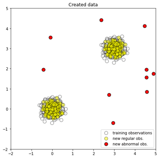
学習データ、テストデータ、外れ値データを作成します。
| # Generating data
rng = np.random.RandomState(SEED)
# Generating training data X_train = 0.2 * rng.randn(1000, 2) X_train = np.r_[X_train + 3, X_train] X_train = pd.DataFrame(X_train, columns = [‘x1’, ‘x2’])
# Generating new, ‘normal’ observation X_test = 0.2 * rng.randn(200, 2) X_test = np.r_[X_test + 3, X_test] X_test = pd.DataFrame(X_test, columns = [‘x1’, ‘x2’])
# Generating outliers X_outliers = np.array([[ 2.75847325, 0.70161192], [ 4.46303665, 4.12416481], [ 2.95194192, -0.70583271], [ 4.90284634, 1.74254385], [ 4.58553235, 0.83913504], [ 4.56851291, 1.55694144], [-0.08220838, 3.55959913], [-0.42706604, 1.95428612], [ 2.36991983, 4.41411535], [ 4.56439646, 1.95638222 ]]) X_outliers = pd.DataFrame(X_outliers, columns = [‘x1’, ‘x2’]) |
散布図を作成します。
白い点は学習データ、黄色点はテストデータ、赤点は外れ値データです。
| # Plotting generated data
plt.title(“Created data”)
p1 = plt.scatter(X_train.x1, X_train.x2, c=’white’, alpha=0.5, s=20*4, edgecolor=’k’) p2 = plt.scatter(X_test.x1, X_test.x2, c=’yellow’, alpha=0.5, s=20*4, edgecolor=’k’) p3 = plt.scatter(X_outliers.x1, X_outliers.x2, c=’red’, s=20*4, edgecolor=’k’)
plt.axis(‘tight’) plt.xlim((-2, 5)) plt.ylim((-2, 5)) plt.legend([p1, p2, p3], [“training observations”, “new regular obs.”, “new abnormal obs.”], loc=”lower right”)
# saving the figure plt.savefig(‘generated_data.png’, dpi=300)
plt.show()
|
3.2 Isolation Forestモデル作成
モデル作成し、テストデータで推論します。
| # Isolation Forest
# training the model clf = IsolationForest(max_samples=100, contamination = 0.1, random_state=rng) clf.fit(X_train)
# predictions y_pred_train = clf.predict(X_train) y_pred_test = clf.predict(X_test) y_pred_outliers = clf.predict(X_outliers)
|
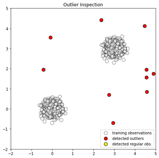
3.3 モデル評価
通常データと非常データを検出ができました。
| # new, ‘normal’ observations print(“Normal Accuracy:”, list(y_pred_test).count(1)/y_pred_test.shape[0]) # outliers print(“Outliers Accuracy:”, list(y_pred_outliers).count(-1)/y_pred_outliers.shape[0]) |
Normal Accuracy: 0.9075
Outliers Accuracy: 1.0
散布図を作成します。
| # Inspecting the outliers
# adding the predicted label X_outliers = X_outliers.assign(y = y_pred_outliers)
plt.title(“Outlier Inspection”)
p1 = plt.scatter(X_train.x1, X_train.x2, c=’white’, alpha=0.5, s=20*4, edgecolor=’k’) p2 = plt.scatter(X_outliers.loc[X_outliers.y == -1, [‘x1’]], X_outliers.loc[X_outliers.y == -1, [‘x2′]], c=’red’, s=20*4, edgecolor=’k’) p3 = plt.scatter(X_outliers.loc[X_outliers.y == 1, [‘x1’]], X_outliers.loc[X_outliers.y == 1, [‘x2′]], c=’yellow’, s=20*4, edgecolor=’k’)
plt.axis(‘tight’) plt.xlim((-2, 5)) plt.ylim((-2, 5)) plt.legend([p1, p2, p3], [“training observations”,”detected outliers”, “detected regular obs.”], loc=”lower right”)
# saving the figure plt.savefig(‘outlier_inspection.png’, dpi=300)
plt.show()
|

担当者:HM
香川県高松市出身 データ分析にて、博士(理学)を取得後、自動車メーカー会社にてデータ分析に関わる。その後コンサルティングファームでデータ分析プロジェクトを歴任後独立 気が付けばデータ分析プロジェクトだけで50以上担当
理化学研究所にて研究員を拝命中 応用数理学会所属